Today is a special day for us at Coletiv.
After the founding in 2017, we never changed our website design and brand until today. Crazy right?
Being a small digital product studio with less than 20 employees, we never had the time to invest in our brand and what it represents.
These past few years, we worked a lot internally. We improved our processes, technologies, and culture, but the message was far from being delivered to the world outside.
That is one of the reasons why, this year, we decided to invest in a complete rebrand.
Why rebrand?
Coletiv is not a typical services agency. We are a digital product studio that helps startups and entrepreneurs design and build products from scratch. We focus on creating high-quality digital products taking them from ideation to market.
And that is where we would like to position ourselves (if you have a product idea, talk to us). In addition to that, we are proud to have an open culture that nurtures growth and ideas.
We work hard to provide a great workplace where our team has the freedom to learn and explore new technologies and areas without restrictions.
Both of these aspects are core in this rebrand.

Why now?
Since our team has been growing, our company culture and vision have become clear. So we figured it was the best time for a refresh.
And we could not wait any longer. We wanted this rebrand even earlier, but you know how things roll in a digital studio. Clients come in and, before you know it, you do not have time for your projects.
But here we are, after months of discussing, designing, and developing. And this is the perfect setting!
"An open culture that nurtures growth and ideas"
Thought-process
At the beginning of the process, we asked each team member to describe our company in one word.
Here is the result:

The words that define Coletiv are “unity” and “growth”. We strive to provide a workplace where our team members have the freedom to learn, explore, and invest in themselves.
Our new brand needed to reflect that and make all these words work together, creating a unique concept.

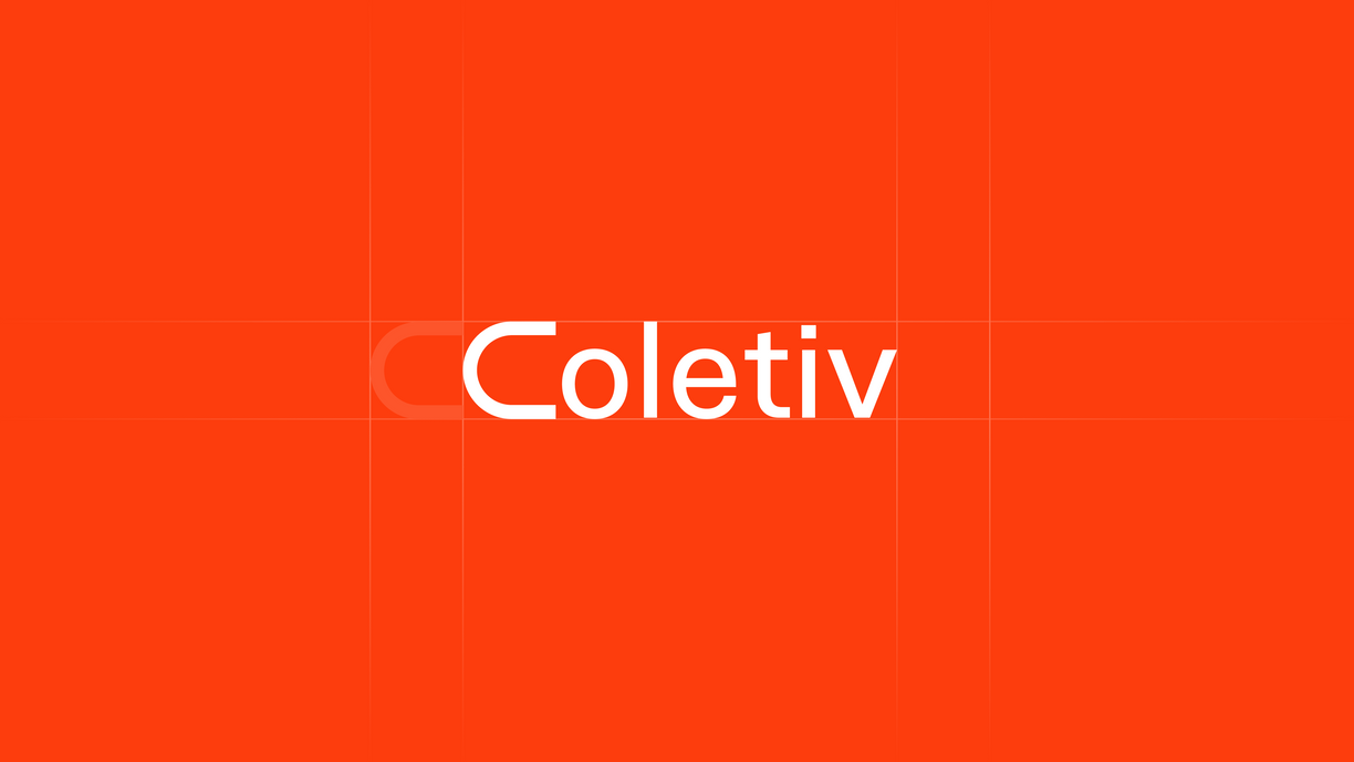
Logo
As a result, our logo incorporates the mathematical symbol of the union "∪".
Because “Coletiv” is a strong word, we decided not to add any visual noise.
We inverted the symbol to act as a replacement to the "C" in Coletiv. Instead of adding more elements to the logo.
This symbol assumes different shapes across our website and other branding materials.

Our previous logo felt trapped in a box. The new logo is simple but without restrictions or borders. Just like our team.
Colors
In terms of colors, we selected a bright and fun pallet to represent the meaningful relationships we have here at Coletiv. Be it with our team or with our customers.
That is why we decided to ditch the blue and get into warmer tones.
As primary colors, we decided to incorporate vivid orange tones. In contrast, we opted for soft pastels as secondary colors.
To balance everything, we use neutral tones such as white, black, and grey.

Typography
Sneak
Our logotype uses an edited version of a sans serif typeface called Sneak. To obtain the long "C" we edited the original "C" from the Sneak typeface with the Glyphs 3 font editor, and from there, we exported a new typeface called Coletiv.
Basis Grotesque
For the text, the idea was to use a Font that aligns with the dynamics of the logo but was more consistent. So we could use it in titles and paragraphs. Basis Grotesque felt like the perfect choice.

Icons
In terms of iconography, we opted for a bold and unique style to match the creative design of our new website.
The new playful iconography is the perfect match for our color gradients. The brand symbol “∪” is also present and embraces many forms.

Website
Our website is the perfect reflection of the new brand and design choices. We included hints of the "∪" union symbol throughout the website, highlighting specific areas.
Unlike our previous website, we focused on showcasing our work rather than playing around with too much text. It also has more team photos: you can see humans now!
The overall style is simple, but it has fun elements like round shapes and bright gradients to make it more interesting.

Final thoughts
We put a lot of love and thought into this rebrand, but we feel that it will continue to improve in the years to come. Our brand will be catered to our culture as it continues to shift and grow. It is not something static that we can leave as is. We are still finding our voice.
Meanwhile, we hope you like this rebrand and that you stick with us throughout this journey.