

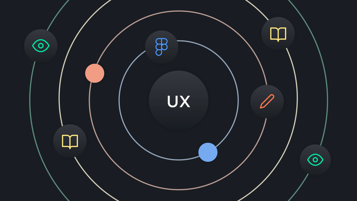


Design
23 February, 2022
Meet the new Coletiv brand
After the founding in 2017, we never changed our website design and brand until today. This year we decided to change that and invest in a complete rebrand.
Design
18 November, 2021
I never thought as a marketer to start learning UX/UI design and Figma amid a global lockdown, checking every resource, and taking a part-time course at night.
A pandemic does change a person!
I never thought as a digital marketer to have the guts to start learning UX/UI amid a global lockdown, checking every resource possible, and taking a part-time course at night after an intense 8-hour workday. Not sure how I survived! 😅
Lately, at Coletiv, I'm lucky to be taking advantage of our Investment Time every Friday afternoon to learn Figma in more detail and design a prototype for a Pokémon application (article coming soon).
With that said, I'd like to share my experience with you and perhaps even inspire you to learn a new skill, like design. 😎
Feel free to jump to any part you'd like:
Digital marketing is a very different field from UX/UI, so many basic concepts were unfamiliar.
My daily work usually involves creating content like articles, social posts, newsletters, landing pages, etc. It's also about analytics and automation, but nothing related to designing digital products. 😱
So, here are some of the alien concepts I learned after taking a part-time UX/UI design course from AllWomen. That maybe you'll have to learn too.
The first concept I learned was the Problem Statement. I learned how to define an actual problem I want to solve using different methodologies. 💡
It helped me learn about assumptions and how dangerous they can be when designing solutions. Sometimes a problem we have is not the ACTUAL problem, so we need to get to the bottom of it.
I practiced an exercise called "5 whys". Which is "an iterative interrogative technique used to explore the cause-and-effect relationships underlying a particular problem."

Image source: Kanbanize
During this process, I also learned to list my assumptions about the problem and write a hypothesis.
UX research is the most challenging. 😩 I learned about different methodologies to gather data about the user and the problem.
It included desk research, user interviews with potential users, and surveys to gather statistical data. The UX research helped me cut down assumptions about users and learn more about their behaviors and challenges.
It is usually where your Miro board gets very messy. 🤣
After research, I needed to learn how to transform different types of data into insights. And it's nothing like in marketing analytics, let me tell you. Nothing is automated. 🥲
During the user interviews, I took many notes so, I had a lot of information to put together. I learned a methodology called Affinity Mapping to group pieces of information that were similar to check common behaviors and problems.
Together with the surveys and desk research, I was able to gather valuable insights.

Image source: Miro
After getting insights about the user, I practiced how to define personas and archetypes, describing goals, needs, behaviors, and frustrations.
But, until this day, I'm still not sure about the difference in using personas and archetypes in UX/UI design, so I'll leave a description by Alan Cooper. 💬
"Personas are hypothetical archetypes of actual users, which means that they are combined representations of needs, desires and pain points of groups of people who share some common traits."
Also, the concept of archetypes as described in this article and book:
"Archetypes are the embodiments of the universal stories that all human beings share. […] Archetypes represent how we manifest the roles we play within those universal stories, the lessons we learn, and the paths we choose to walk."
With a better definition of my user, I was able to create user journeys with detailed steps. It helped me identify opportunities and challenges throughout the journey.
Below is an example of a user journey 👇

Image source: Smaply Blog
Here goes the definition of a wireframe:
"an image or set of images which displays the functional elements of a website or page, typically used for planning a site's structure and functionality."
Low-fi wireframes allow testing different possibilities and flows. Because it has fewer details, it's easier to adjust later on than a fully designed interface. 🙌
I also learned a method called Crazy 8's that allows exploring many ideas you have for a solution in 8 minutes. The best ones got into my wireframes.
"Crazy 8's is a core Design Sprint method. It is a fast sketching exercise that challenges people to sketch eight distinct ideas in eight minutes."
As a beginner, I also needed to learn the concept of Grids to organize my elements inside the wireframes. Make sure to read about it too. 💪

Image source: Miro
After designing the wireframes, I learned how to test the flow with potential users.
With Figma, you can easily create wireframes and prototype them so that it feels like an application. And then, share it with anyone to test it out.
Don't forget to record their journey and reactions throughout your wireframes, and be a good listener! 👂After the usability testing, you can understand where to improve your flow.
Finally, the fun part comes! Well, at least for me. 🤣
Here I needed to learn everything from colors, typography, creating a mood board, icons, and everything related to the look and feel of an application.
There are some great free resources to use in your first UI project. For example, in Figma Community, you can find everything from plugins to components, icons, and illustrations.
In terms of guidelines for buttons and other elements, I recommend checking out Google's Material Guidelines.
There are many tools out there that can be very useful to you if you're also learning UX/UI. Here are some that saved my life when designing my first app.
Graphic design also plays a crucial role in UI design. If you don't know how to create icons and illustrations from scratch, below are some links that can be useful.
When you're a beginner, the best thing you can do is take advantage of community resources. Figma Community, for example, is a great place to start.
Now that I've shared some essential concepts let's talk about learning a design tool. There are many design and prototyping tools to choose from, for example, Sketch, Invision, Marvel, and Figma.
At Coletiv, we are using Figma in our design projects. It has an easy interface, great resources, and many handy collaboration features.
Although I had some experience with Figma before, I decided to take an Udemy course that could explore all its features. So, during my investment time at Coletiv, I completed the "Learn Figma - UI/UX Design Essential Training" course by Caleb Kingston. 💪

It teaches everything you need to know to get familiar with Figma. And explores all main features like frames, shapes, the pen tool, components, prototyping, and all that jazz.
During this course, you will be designing and prototyping a Chef's recipes app from scratch.
Here's how the app looks in the end 👇

Please note that the course does not explain how to organize elements in terms of spacing and alignment. That's why mine ended up being so messy. 🤣 But it was a great tutorial to explore Figma. I recommend it!
Lately, I've been putting all this into practice as I'm designing a Pokémon application in Figma. So keep following us since I'll be sharing that in our blog soon.
Learning a new field is scary, but it's rewarding. It makes you feel like you can do whatever you set your mind to. And the truth is, you can! Props to Claudia from our team that transitioned from Biology to Web development. 😎
But of course, it's challenging. I'm aware that some visual rules that are basic for designers feel like a complicated science in the eyes of a marketer (just like copywriting can be for designers). The key is to be consistent and keep practicing! 💪
At Coletiv, I'm still learning and getting familiar with this new world of UI/UX, and I'm not sure where this journey will take me, but it's more knowledge that I can add to my work.
That can only be good. Right? 😉
Join our newsletter
Be part of our community and stay up to date with the latest blog posts.
SubscribeJoin our newsletter
Be part of our community and stay up to date with the latest blog posts.
SubscribeDesign
23 February, 2022
After the founding in 2017, we never changed our website design and brand until today. This year we decided to change that and invest in a complete rebrand.
Design
14 December, 2021
Developers joining our team need to build a Pokémon application to fetch the entire list of Pokémon from an external API. Here is my journey designing the user interface.

